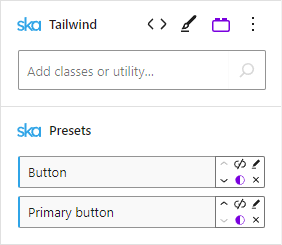
When using ska-theme buttons can be styled by adding the Button preset to an element:
<!-- wp:ska/text {"skaBlocksAs":{"element":"a","href":"#"},"skaBlocks":{"p":[{"id":"ska-theme\u002d\u002dbutton","isStatic":true}],"t":1744868963}} -->
<a href="#" class="wp-block-ska-text ska-text">Neutral button</a>
<!-- /wp:ska/text -->
Adding the Primary button preset alongside the Button preset produces a primary button, whose styles are also added to default WordPress buttons (.wp-element-button) in various locations:
<!-- wp:ska/text {"skaBlocksAs":{"element":"a","href":"#"},"skaBlocks":{"p":[{"id":"ska-theme\u002d\u002dbutton","isStatic":true},{"id":"ska-theme\u002d\u002dprimary-button","isStatic":true}],"t":1744868963}} -->
<a href="#" class="wp-block-ska-text ska-text">Primary button</a>
<!-- /wp:ska/text -->
By default the Button preset is set up to use CSS variables for its’ colors (--fg: foreground (text) color, --bg: background color and --accent: focus ring color), so the Primary button preset simply overrides these variables to produce a button with a different appearance ([--fg:var(--color-site-inverted)] [--bg:var(--color-primary)] [--accent:var(--color-primary)]).
The preset should come after the original Button preset, otherwise neutral button styles will take precedence:
Adding the Outline button preset instead of the Primary button preset will produce an outline button:
<!-- wp:ska/text {"skaBlocksAs":{"element":"a","href":"#"},"skaBlocks":{"p":[{"id":"ska-theme\u002d\u002dbutton","isStatic":true},{"id":"ska-theme\u002d\u002doutline-button","isStatic":true}],"t":1744868963}} -->
<a href="#" class="wp-block-ska-text ska-text">Outline button</a>
<!-- /wp:ska/text -->
The button preset uses em units for padding which allows to apply Tailwind font-size classes text-sm, text-lg etc to change the button size:
<!-- wp:ska/element {"skaBlocks":{"cx":"flex flex-col gap-2 items-start","css":".flex{display:flex}.flex-col{flex-direction:column}.gap-2{gap:var(\u002d\u002dspacing-2)}.items-start{align-items:flex-start}","t":1744868963},"skaBlocksDisplay":{"v":{"$":{"@":"flex"}}},"skaBlocksFlexDirection":{"v":{"$":{"@":"col"}}},"skaBlocksGap":{"v":{"$":{"@":"2"}}},"skaBlocksAlignItems":{"v":{"$":{"@":"start"}}}} -->
<div class="flex flex-col gap-2 items-start wp-block-ska-element"><!-- wp:ska/text {"skaBlocksFontSize":{"v":{"$":{"@":"xs"}}},"skaBlocksAs":{"element":"a","href":"#"},"skaBlocks":{"cx":"text-xs","css":".text-xs{font-size:var(\u002d\u002dtext-xs);line-height:var(\u002d\u002dtw-leading,var(\u002d\u002dtext-xs\u002d\u002dline-height))}","t":1744868963,"p":[{"id":"ska-theme\u002d\u002dbutton","isStatic":true},{"id":"ska-theme\u002d\u002dprimary-button","isStatic":true}]}} -->
<a href="#" class="text-xs wp-block-ska-text ska-text">Primary button</a>
<!-- /wp:ska/text -->

<!-- wp:ska/text {"skaBlocksFontSize":{"v":{"$":{"@":"sm"}}},"skaBlocksAs":{"element":"a","href":"#"},"skaBlocks":{"cx":"text-sm","css":".text-sm{font-size:var(\u002d\u002dtext-sm);line-height:var(\u002d\u002dtw-leading,var(\u002d\u002dtext-sm\u002d\u002dline-height))}","t":1744868963,"p":[{"id":"ska-theme\u002d\u002dbutton","isStatic":true},{"id":"ska-theme\u002d\u002dprimary-button","isStatic":true}]}} -->
<a href="#" class="text-sm wp-block-ska-text ska-text">Primary button</a>
<!-- /wp:ska/text -->

<!-- wp:ska/text {"skaBlocksFontSize":{"v":{"$":{"@":"base"}}},"skaBlocksAs":{"element":"a","href":"#"},"skaBlocks":{"cx":"text-base","css":".text-base{font-size:var(\u002d\u002dtext-base);line-height:var(\u002d\u002dtw-leading,var(\u002d\u002dtext-base\u002d\u002dline-height))}","t":1744868963,"p":[{"id":"ska-theme\u002d\u002dbutton","isStatic":true},{"id":"ska-theme\u002d\u002dprimary-button","isStatic":true}]}} -->
<a href="#" class="text-base wp-block-ska-text ska-text">Primary button</a>
<!-- /wp:ska/text -->

<!-- wp:ska/text {"skaBlocksFontSize":{"v":{"$":{"@":"lg"}}},"skaBlocksAs":{"element":"a","href":"#"},"skaBlocks":{"cx":"text-lg","css":".text-lg{font-size:var(\u002d\u002dtext-lg);line-height:var(\u002d\u002dtw-leading,var(\u002d\u002dtext-lg\u002d\u002dline-height))}","t":1744868963,"p":[{"id":"ska-theme\u002d\u002dbutton","isStatic":true},{"id":"ska-theme\u002d\u002dprimary-button","isStatic":true}]}} -->
<a href="#" class="text-lg wp-block-ska-text ska-text">Primary button</a>
<!-- /wp:ska/text -->

<!-- wp:ska/text {"skaBlocksFontSize":{"v":{"$":{"@":"xl"}}},"skaBlocksAs":{"element":"a","href":"#"},"skaBlocks":{"cx":"text-xl","css":".text-xl{font-size:var(\u002d\u002dtext-xl);line-height:var(\u002d\u002dtw-leading,var(\u002d\u002dtext-xl\u002d\u002dline-height))}","t":1744868963,"p":[{"id":"ska-theme\u002d\u002dbutton","isStatic":true},{"id":"ska-theme\u002d\u002dprimary-button","isStatic":true}]}} -->
<a href="#" class="text-xl wp-block-ska-text ska-text">Primary button</a>
<!-- /wp:ska/text -->

<!-- wp:ska/text {"skaBlocksFontSize":{"v":{"$":{"@":"2xl"}}},"skaBlocksAs":{"element":"a","href":"#"},"skaBlocks":{"cx":"text-2xl","css":".text-2xl{font-size:var(\u002d\u002dtext-2xl);line-height:var(\u002d\u002dtw-leading,var(\u002d\u002dtext-2xl\u002d\u002dline-height))}","t":1744868963,"p":[{"id":"ska-theme\u002d\u002dbutton","isStatic":true},{"id":"ska-theme\u002d\u002dprimary-button","isStatic":true}]}} -->
<a href="#" class="text-2xl wp-block-ska-text ska-text">Primary button</a>
<!-- /wp:ska/text --></div>
<!-- /wp:ska/element -->
Using bg-transparent hover:bg-transparent border-transparent hover:border-transparent hover:underline on a neutral button can produce a link button:
<!-- wp:ska/text {"skaBlocksTextDecoration":{"v":{"$":{"@":""},"hover":{"@":"underline"}}},"skaBlocksBackgroundColor":{"v":{"$":{"@":"transparent"},"hover":{"@":"transparent"}}},"skaBlocksBorderColor":{"v":{"$":{"@":"transparent"},"hover":{"@":"transparent"}}},"skaBlocksAs":{"element":"a","href":"#"},"skaBlocks":{"cx":"hover:underline bg-transparent hover:bg-transparent border-transparent hover:border-transparent","css":"@media (hover:hover){.hover\\:underline:hover{text-decoration-line:underline}}.bg-transparent{background-color:#0000}@media (hover:hover){.hover\\:bg-transparent:hover{background-color:#0000}}.border-transparent{border-color:#0000}@media (hover:hover){.hover\\:border-transparent:hover{border-color:#0000}}","t":1744868963,"p":[{"id":"ska-theme\u002d\u002dbutton","isStatic":true}]}} -->
<a href="#" class="hover:underline bg-transparent hover:bg-transparent border-transparent hover:border-transparent wp-block-ska-text ska-text">Link button</a>
<!-- /wp:ska/text -->
The rounded-full class can produce a circular button:
<!-- wp:ska/text {"skaBlocksBorderRadius":{"v":{"$":{"@":"full"}}},"skaBlocksAs":{"element":"a","href":"#"},"skaBlocks":{"cx":"rounded-full","css":".rounded-full{border-radius:3.40282e38px}","t":1744868963,"p":[{"id":"ska-theme\u002d\u002dbutton","isStatic":true},{"id":"ska-theme\u002d\u002dprimary-button","isStatic":true}]}} -->
<a href="#" class="rounded-full wp-block-ska-text ska-text">Primary button</a>
<!-- /wp:ska/text -->
Custom buttons can be created (as presets (and variations)) as needed, such as:
<!-- wp:ska/text {"skaBlocksAs":{"element":"a","href":"#"},"skaBlocks":{"cx":"[\u002d\u002dfg:var(\u002d\u002dcolor-site-inverted)] [\u002d\u002dbg:var(\u002d\u002dcolor-positive)] [\u002d\u002daccent:var(\u002d\u002dcolor-positive)]","css":".\\[\u002d\u002dfg\\:var\\(\u002d\u002dcolor-site-inverted\\)\\]{\u002d\u002dfg:var(\u002d\u002dcolor-site-inverted)}.\\[\u002d\u002dbg\\:var\\(\u002d\u002dcolor-positive\\)\\]{\u002d\u002dbg:var(\u002d\u002dcolor-positive)}.\\[\u002d\u002daccent\\:var\\(\u002d\u002dcolor-positive\\)\\]{\u002d\u002daccent:var(\u002d\u002dcolor-positive)}","t":1744868963,"p":[{"id":"ska-theme\u002d\u002dbutton","isStatic":true}]},"skaBlocksVariables":{"record":{"\u002d\u002dfg":{"value":"var(\u002d\u002dcolor-site-inverted)","type":"color"},"\u002d\u002dbg":{"value":"var(\u002d\u002dcolor-positive)","type":"color"},"\u002d\u002daccent":{"value":"var(\u002d\u002dcolor-positive)","type":"color"}}}} -->
<a href="#" class="[--fg:var(--color-site-inverted)] [--bg:var(--color-positive)] [--accent:var(--color-positive)] wp-block-ska-text ska-text">Positive button</a>
<!-- /wp:ska/text --><!-- wp:ska/text {"skaBlocksAs":{"element":"a","href":"#"},"skaBlocks":{"cx":"[\u002d\u002dfg:var(\u002d\u002dcolor-site-inverted)] [\u002d\u002dbg:var(\u002d\u002dcolor-negative)] [\u002d\u002daccent:var(\u002d\u002dcolor-negative)]","css":".\\[\u002d\u002dfg\\:var\\(\u002d\u002dcolor-site-inverted\\)\\]{\u002d\u002dfg:var(\u002d\u002dcolor-site-inverted)}.\\[\u002d\u002dbg\\:var\\(\u002d\u002dcolor-negative\\)\\]{\u002d\u002dbg:var(\u002d\u002dcolor-negative)}.\\[\u002d\u002daccent\\:var\\(\u002d\u002dcolor-negative\\)\\]{\u002d\u002daccent:var(\u002d\u002dcolor-negative)}","t":1744868963,"p":[{"id":"ska-theme\u002d\u002dbutton","isStatic":true}]},"skaBlocksVariables":{"record":{"\u002d\u002dfg":{"value":"var(\u002d\u002dcolor-site-inverted)","type":"color"},"\u002d\u002dbg":{"value":"var(\u002d\u002dcolor-negative)","type":"color"},"\u002d\u002daccent":{"value":"var(\u002d\u002dcolor-negative)","type":"color"}}}} -->
<a href="#" class="[--fg:var(--color-site-inverted)] [--bg:var(--color-negative)] [--accent:var(--color-negative)] wp-block-ska-text ska-text">Negative button</a>
<!-- /wp:ska/text --><!-- wp:ska/text {"skaBlocksAs":{"element":"a","href":"#"},"skaBlocks":{"cx":"[\u002d\u002dfg:var(\u002d\u002dcolor-site-inverted)] [\u002d\u002dbg:var(\u002d\u002dcolor-warning)] [\u002d\u002daccent:var(\u002d\u002dcolor-warning)]","css":".\\[\u002d\u002dfg\\:var\\(\u002d\u002dcolor-site-inverted\\)\\]{\u002d\u002dfg:var(\u002d\u002dcolor-site-inverted)}.\\[\u002d\u002dbg\\:var\\(\u002d\u002dcolor-warning\\)\\]{\u002d\u002dbg:var(\u002d\u002dcolor-warning)}.\\[\u002d\u002daccent\\:var\\(\u002d\u002dcolor-warning\\)\\]{\u002d\u002daccent:var(\u002d\u002dcolor-warning)}","t":1744868963,"p":[{"id":"ska-theme\u002d\u002dbutton","isStatic":true}]},"skaBlocksVariables":{"record":{"\u002d\u002dfg":{"value":"var(\u002d\u002dcolor-site-inverted)","type":"color"},"\u002d\u002dbg":{"value":"var(\u002d\u002dcolor-warning)","type":"color"},"\u002d\u002daccent":{"value":"var(\u002d\u002dcolor-warning)","type":"color"}}}} -->
<a href="#" class="[--fg:var(--color-site-inverted)] [--bg:var(--color-warning)] [--accent:var(--color-warning)] wp-block-ska-text ska-text">Warning button</a>
<!-- /wp:ska/text --><!-- wp:ska/element {"skaBlocks":{"p":[{"id":"ska-theme\u002d\u002dbutton","isStatic":true}],"t":1744868963},"skaBlocksAs":{"element":"a","href":"#"}} -->
<a href="#" class="wp-block-ska-element"><!-- wp:ska/text -->
<span class="wp-block-ska-text ska-text">Icon button</span>
<!-- /wp:ska/text -->
<!-- wp:ska/image {"mode":"icon","svg":"\u003csvg data-svg-width=\u002224\u0022 data-svg-height=\u002224\u0022 viewBox=\u00220 0 24 24\u0022 fill=\u0022none\u0022 xmlns=\u0022http://www.w3.org/2000/svg\u0022\u003e\n\u003cpath fill-rule=\u0022evenodd\u0022 clip-rule=\u0022evenodd\u0022 d=\u0022M12.9697 3.96967C13.2626 3.67678 13.7374 3.67678 14.0303 3.96967L21.5303 11.4697C21.671 11.6103 21.75 11.8011 21.75 12C21.75 12.1989 21.671 12.3897 21.5303 12.5303L14.0303 20.0303C13.7374 20.3232 13.2626 20.3232 12.9697 20.0303C12.6768 19.7374 12.6768 19.2626 12.9697 18.9697L19.1893 12.75H3C2.58579 12.75 2.25 12.4142 2.25 12C2.25 11.5858 2.58579 11.25 3 11.25H19.1893L12.9697 5.03033C12.6768 4.73744 12.6768 4.26256 12.9697 3.96967Z\u0022 fill=\u0022currentColor\u0022/\u003e\n\u003c/svg\u003e\n","collection":"heroicons","icon":"24/solid/arrow-right","skaBlocks":{"cx":"w-4 h-auto text-current","css":".w-4{width:var(\u002d\u002dspacing-4)}.h-auto{height:auto}.text-current{color:currentColor}","t":1744868963},"skaBlocksWidth":{"v":{"$":{"@":"4"}}},"skaBlocksHeight":{"v":{"$":{"@":"auto"}}},"skaBlocksTextColor":{"v":{"$":{"@":"current"}}}} -->
<div role="figure" aria-hidden="true" class="w-4 h-auto text-current wp-block-ska-image"><svg data-svg-width="24" data-svg-height="24" viewBox="0 0 24 24" fill="none" xmlns="http://www.w3.org/2000/svg">
<path fill-rule="evenodd" clip-rule="evenodd" d="M12.9697 3.96967C13.2626 3.67678 13.7374 3.67678 14.0303 3.96967L21.5303 11.4697C21.671 11.6103 21.75 11.8011 21.75 12C21.75 12.1989 21.671 12.3897 21.5303 12.5303L14.0303 20.0303C13.7374 20.3232 13.2626 20.3232 12.9697 20.0303C12.6768 19.7374 12.6768 19.2626 12.9697 18.9697L19.1893 12.75H3C2.58579 12.75 2.25 12.4142 2.25 12C2.25 11.5858 2.58579 11.25 3 11.25H19.1893L12.9697 5.03033C12.6768 4.73744 12.6768 4.26256 12.9697 3.96967Z" fill="currentColor"></path>
</svg></div>
<!-- /wp:ska/image --></a>
<!-- /wp:ska/element --><!-- wp:ska/text {"skaBlocksMinWidth":{"v":{"$":{"@":"56!"}}},"skaBlocksAs":{"element":"a","href":"#"},"skaBlocks":{"cx":"min-w-56!","css":".min-w-56\\!{min-width:var(\u002d\u002dspacing-56)!important}","t":1744868963,"p":[{"id":"ska-theme\u002d\u002dbutton","isStatic":true},{"id":"ska-theme\u002d\u002dprimary-button","isStatic":true}]}} -->
<a href="#" class="min-w-56! wp-block-ska-text ska-text">Wide button</a>
<!-- /wp:ska/text -->