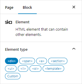
The Element block is a block that can contain other blocks.
By default the HTML tag name div is used, but it can be changed using the Element type block controls:
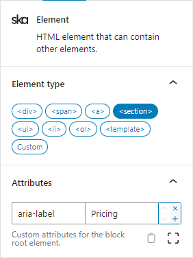
The block also supports receiving any custom attributes:
As with most blocks, the block also accepts Tailwind classes.
In combination with a custom tag name, custom attributes and any Tailwind classes, the Element block can be used to create almost anything you could normally write manually in plain HTML.
Most commonly you may wish to display items in a row:
flex flex-col sm:flex-row gap-4
or in a grid:
grid sm:grid-cols-2 lg:grid-cols-4 gap-3 md:gap-6
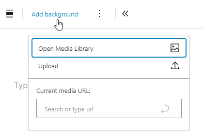
For simplicity, the block also supports adding a background image or video directly from the WordPress media library by selecting Add background from the block toolbar:
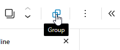
In ska-blocks plugin options under General it is possible to use ska/element block as the default grouping block. This allows you to easily wrap multiple selected blocks in the Element block:
While the WordPress core/group block is capable of displaying items in a “Row”, “Stack” or a “Grid” by using simple button controls, you may find that when it’s needed to more granularly customize the behavior (such as flex direction, justification, gap, column/row spanning, etc) on different screen sizes, it will become confusing to mix the “WordPress way” of doing things and additional Tailwind classes (for features that WP doesn’t support), that is why using the ska/element block from the get go you will only have Tailwind classes and know exactly what behavior you are getting and where to change it. If everything is defined using Tailwind classes you are also able to create Presets to later reuse that behavior elsewhere.
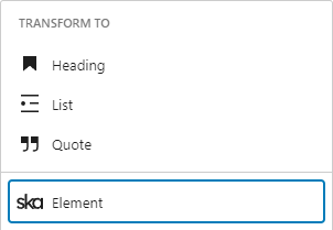
Transforming a block to Element block will also wrap the block that is being “transformed”: